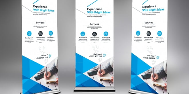
When you have a show to put up or a product to sell. Roll up banners come to your rescue. They are the aptest tool that can help an exhibitor to put up a great trade show. They are the best medium to advertise; all you need to do is place it somewhere where people congregate. It is the point of contact between people and your sale. Hence, designing a roll-up banner is never easy. Space is limited, and you have to fill it with the right color, images, and information to impact the customers. It the way to promote your brand and reach an audience by speaking minimum. To make an effective manner and make it in such a way that people notice, you should keep the following things in mind.
KEEP YOUR LOGO AT THE TOP
Remember to place the brand’s logo at the top while the messages should be placed at eye level. It could be read easily. Right from our school days, we have been taught to read things from top to bottom and from left to right. The same rule applies to your customers as well. Be mindful of this while laying out the flow of information on your banner. Always keep information relevant and keep words to a minimum because less is always more when it comes to the banner.
HIGH-QUALITY IMAGES
Since you are catching people’s attention and luring them towards your brand, you must keep in mind to put up relevant images. Don’t just download any image from the website and pop it into your banner. Those images are usually saved in RGB mode, while to make sure your banners are print-ready, you must save them in CMYK mode and set the resolution at 300 dots per inch. Your images are the royalty of your roll-up banner.
COLOR AND TEXT
Colors are your banner’s best friend. So choose colors that tie with your existing corporate colors and logos. The background color should also be chosen wisely concerning texts and images. All images and texts need to be readable. Therefore, use colors like red and orange that grab attention and avoid colors like yellow and white, which are not readable from a distance. Further, typography and arrangement of letters should be appealing. Typography can make or break your banner. Designing a typeface is the most difficult job when it comes to visual and graphic design.
SIZE AND AESTHETICS
Aesthetic is basically the mind’s capability to differentiate between what is beautiful and what is ugly. If your customers want to identify you with your brand so you must be mindful of design aesthetics. Banners range in size from the 13-inch tabletop retractable banner all the way up to the 6.8-foot tall Roll Up Standard. The size completely depends on your advertising needs. However, in the case of a roll up banner, It’s best to go for smaller sizes.
CONTACT DETAILS
This point is critical for those who are exhibitors. You may not be able to talk to everyone in attendance. So your contact details will help your customers to reach you and your product. So if you mention contact details, it will help your customers avail of your service and locate you easily. Hence, Include your name, contact number, website details on the banner. Always remember to have a plan in place and measure the effectiveness of the banner. Hope these tips have given you a pretty solid start when it comes to how to design a roll-up banner.
